Intro to Bootstrap 3
Welcome!
Wifi Info
Network: SecureSet-Guest
Password: SsecureGuest12345!
Download workshop files
If you have not already downloaded the files for this workshop - please download them at gdiboulder.com/bootstrap
Thanks to our sponsor:
Meet your instructor: Cara Jo Miller
- Co-founder: Girl Develop It Boulder
- Designer/Developer: Rachio
- E-mail: carajo@girldevelopit.com
- Twitter: @cojorado
Let's get to know you!
Download workshop files
If you have not already downloaded the files for this workshop - please download them at gdiboulder.com/bootstrap
What we will be covering in this workshop
- Downloading Bootstrap and incorporating it into an HTML document
- Working with the Bootstrap responsive grid system
- Exploring Bootstrap’s core CSS, overriding this CSS using standard CSS techniques
- Incorporating Bootstrap’s image formatting elements and icons
- Creating and styling fully responsive interactive menus with Bootstrap.
What this workshop will NOT be covering
- Creating fully customized 'themes' for Bootstrap
- Designing an app
- Using all the JavaScripts with Bootstrap
What is Bootstrap?
What is Bootstrap?
Twitter's Bootstrap is a frontend UI (user interface) framework that speeds up the development of new websites and web applications.
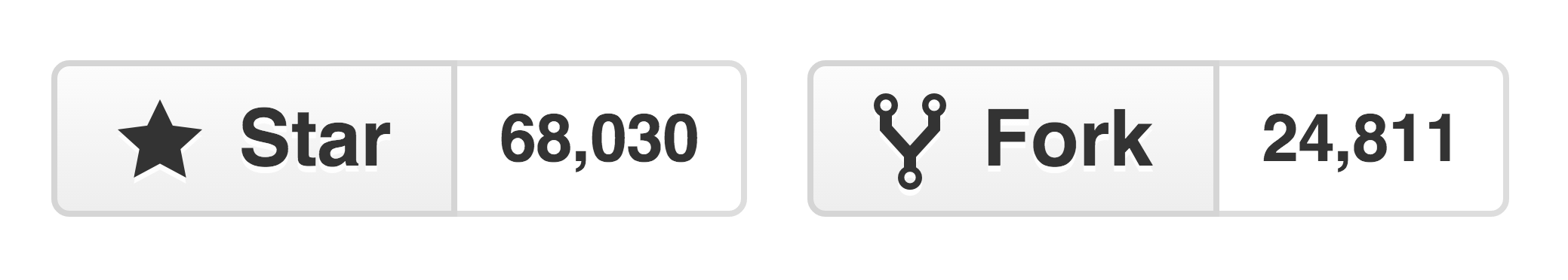
It is the #1 project on github with 65,000+ stars and over 23,000 forks
Bootstrap is an open source project on GitHub, meaning anyone can contribute to its progress.
What is a front-end framework?
What is a front-end framework?
A front-end web development framework is simply a collection of production-ready HTML/CSS/JavaScript components that we can use in our designs.
What is a front-end framework?
Bear in mind that Bootstrap is not just a CSS grid. It also comes with tons of features that you can use to build a fully-functional website.
Why would I want to use Bootstrap?
Why would I want to use Bootstrap?
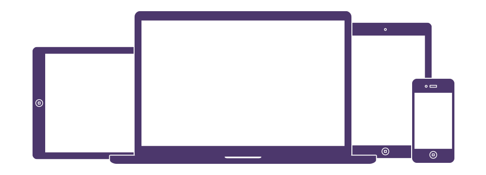
Bootstrap is designed to be responsive, which means that your HTML elements will respond to changes in screen size.
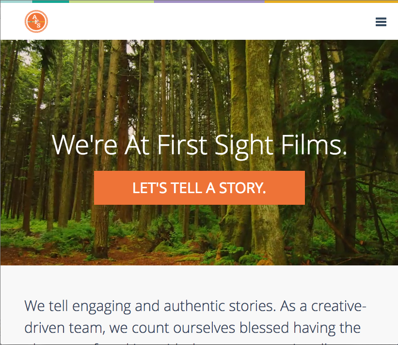
So this desktop design:
Also looks great on a tablet:
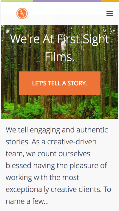
And rad on a smartphone!
Why would I want to use Bootstrap?
Bootstrap is also mobile-first, which means that certain mobile-friendly styles (like the ability to zoom in) are included in the core files.
Why would I want to use Bootstrap?
Bootstrap stylishly fast-tracks your web development. It's an excellent tool to get your project up and running in no time!
What comes with Bootstrap?
Download Files
You can download all the necessary Bootstrap files from getbootstrap.com or from the Bootstrap repo on GitHub.
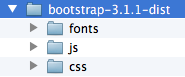
(We included all of these in your Example Files folder, so no need to download from Bootstrap today!)The File Structure
Base CSS:
Styles for common HTML elements, including the grid system, typography, tables, forms, and buttons.
Components:
Styles for common user interface elements, like tabs & pills, breadcrumbs, navigation bars, alerts, page headers, and more.
JavaScript Plugins:
Similar to components, Bootstrap uses JavaScript plugins for tooltips, popovers, carousels, modal windows, and other elements
See it in action!
Check out some of the components by opening the example.html file in your browser window.
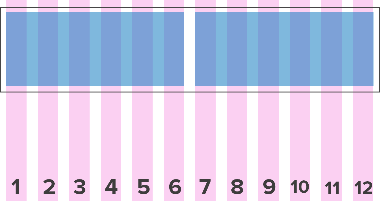
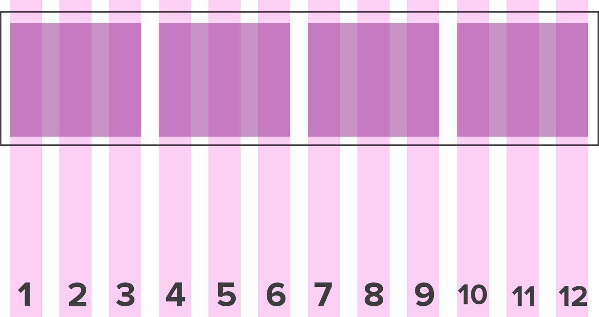
The Bootstrap Grid System
Bootstrap is based on a 12-column grid, and uses CSS classes to decide the width of each element.
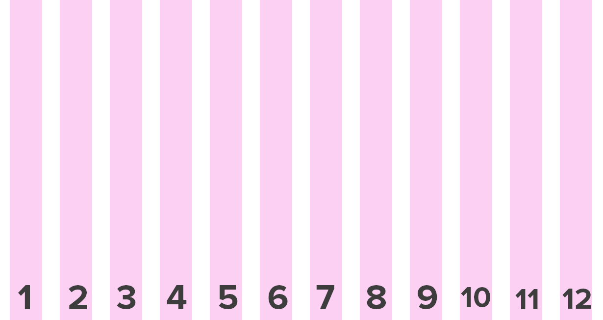
Each element can take up between 1-12 columns worth of space...
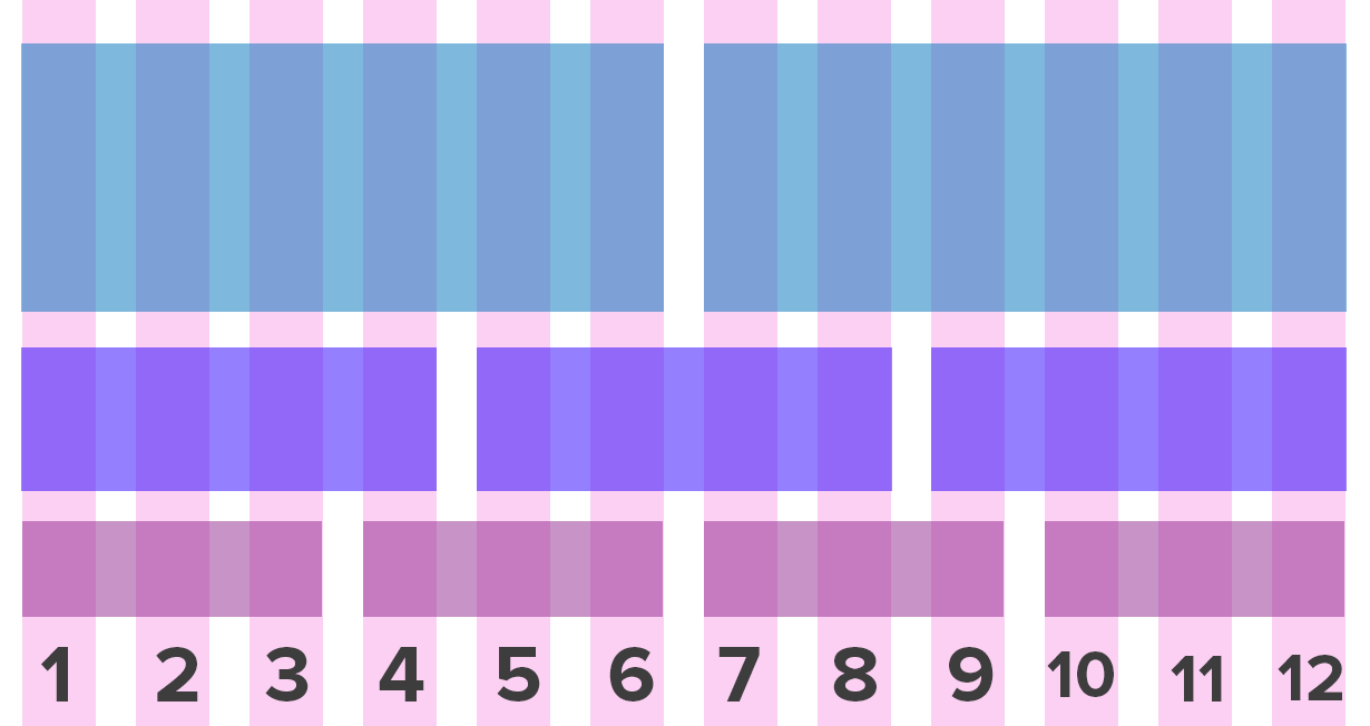
Some Rules:
- Rows must be placed within a
.container(fixed-width) or.container-fluid(full-width) for proper alignment and padding. - Use rows (
.row) to create horizontal groups of columns. - Content should be placed within columns, and only columns may be immediate children of rows.
Code Example
[CONTENT FOR ROW]
See it in action!
Open up columns.html in your browser window.
Resize your browser to see where the columns break to fit 100% of the width.
See it in action!
Open up columns-fluid.html in your browser window.
Resize your browser to see where the columns break to fit 100% of the width.
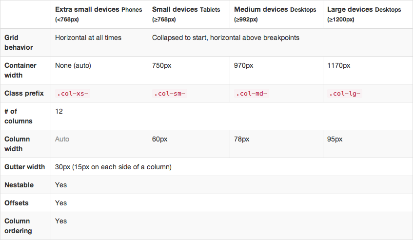
Column Classes
In other words...
If you want to have two 50% columns on a mobile phone, you would use .col-xs-6 nested in a .row, and the rows would be consistent on every device...
Two 50% width columns
            [COLUMN 1 CONTENT]


            [COLUMN 2 CONTENT]
Two 50% columns on a mobile phone
If you want to have four 25% columns on a desktop, and would like them to break to 100% on a tablet, you would use .col-md-3 nested in a .row.
Four 25% width columns
            [COLUMN 1 CONTENT]


            [COLUMN 2 CONTENT]


            [COLUMN 3 CONTENT]


            [COLUMN 4 CONTENT]
Four 25% columns on desktop that break to 100% width on a tablet.
Develop it!
1. Open index.html in Sublime Text and make a simple, two-column layout.
1a. Extra credit: make a three-column layout.
2. Don't forget to put some content in your columns.
3. Resize your browser to see what happens.
Bootstrap Navigation
Bootstrap has 4 different types of navigation
1. Default
Default Navbars are responsive meta components that serve as navigation headers for your application or site. They begin collapsed (and are toggleable) in mobile views and become horizontal as the available viewport width increases.
2. Fixed to Top
Add .navbar-fixed-top and include a .container or .container-fluid to center and pad navbar content.
Body Padding Required:
body { padding-top: 70px; }
3. Fixed to Bottom
Add .navbar-fixed-bottom and include a .container or .container-fluid to center and pad navbar content.
Body Padding Required:
body { padding-bottom: 70px; }
4. Static Top
Full-width navbar that scrolls away with the page.
Develop it!
Add a navbar of your choice to index.html.
Jumbotron
Jumbotron
A lightweight, flexible component that can optionally extend the entire viewport to showcase key content on your site.
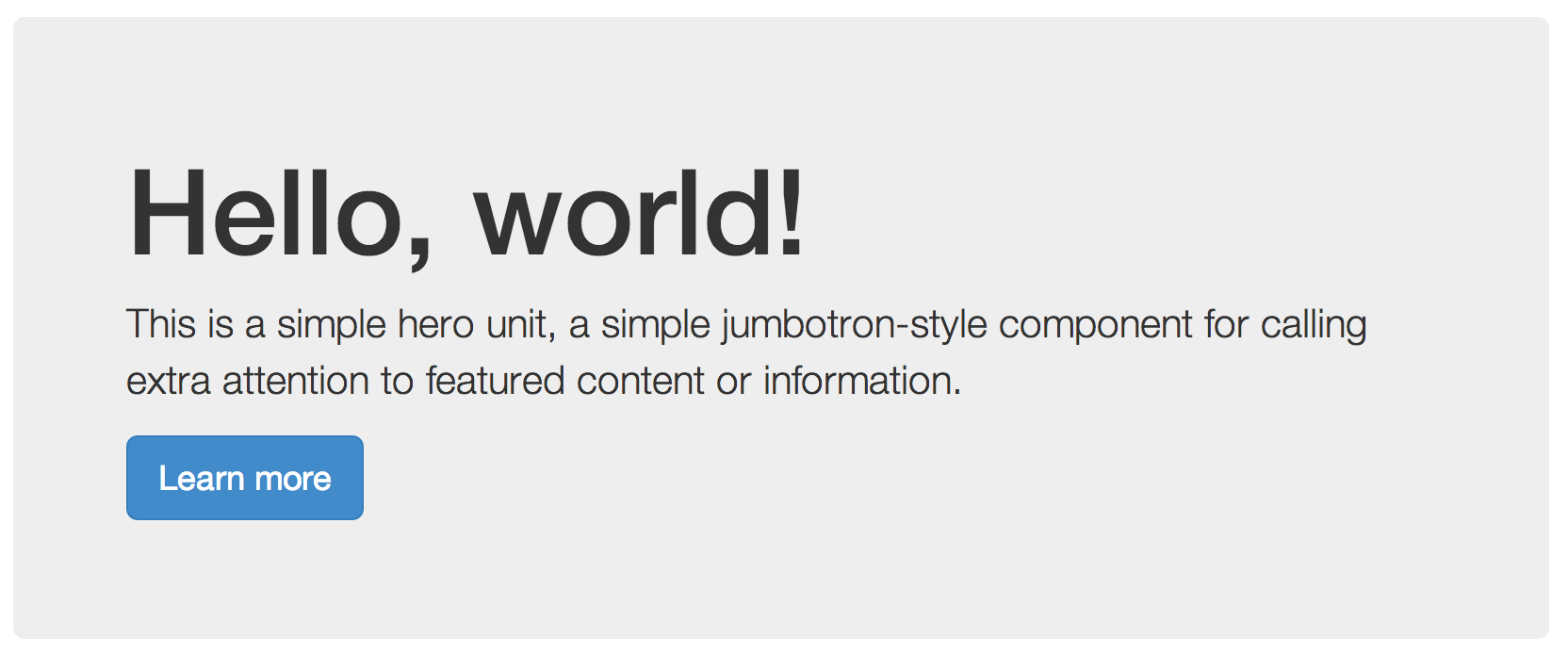
Code Example
  Hello, world!
  ...
Develop it!
Add a jumbotron to index.html.
In the jumbotron, include a headline, a paragraph, and a button.
Images Within Columns
Images Within Columns
Images in Bootstrap 3 can be made responsive-friendly via the addition of the .img-responsive class. This applies max-width: 100%; and height: auto; to the image so that it scales nicely to the parent element.
Bootstrap also includes the following classes to make styling your images easier:
.img-roundedapplies rounded edges.img-circletakes a square image and applies the styleborder-radius: 50%;.img-thumbnailapplies a border with rounded edges to the image

Develop it!
Add images to your columns
(hint: we included some puppy photos in the images folder of your example files!)
(hint x2: remember to make your img src="" relative!)
BUTTTTONS!
Buttons!
Bootstrap comes with some amazing button classes for you to use out of the box. We all know that making those perfectly subtle rounded cornered buttons, is a pain.
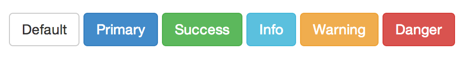
Buttons
The .btn class can be applied to either a
<button> or a <a>
But wait - there's more!
Bootstrap has different classes for providing extra visual weight and identifig the primary action in a set of buttons.
Fancy some bigger or smaller buttons?
Sometimes you need a really big button for that call to action.
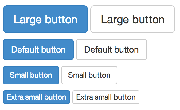
Add a size class to buttons
For larger or smaller buttons add .btn-lg, .btn-sm, or .btn-xs for additional sizes.
Develop It!
Add buttons to your columns.
Add a larger button to your jumbotron.
Extra Credit: play with the different classes for different colors.
Customize!
Customize your CSS before you even download your Bootstrap files by visiting http://getbootstrap.com/customize/
Customize!
Want to customize your Bootstrap page even more? Just create your own CSS and include it in the head, below the Bootstrap CSS to add and override styles!
Tips and Tricks
Before you start creating custom CSS for your design, always check the Bootstrap documentation to see if they've already created a class that does what you want.
Bootstrap Resources
Get Bootstrap: All documentation and download files for Bootstrap
Bootstrap Expo: Check out all the rad site designs that use Bootstrap
Bootstrap on GitHub: Check out the Bootstrap repo. Maybe even contribute to the project!
Upcoming Events
Code & Coffee
Amante Coffee on Baseline
September 27th 10am - 1pm
NEW LOCATION!
Advanced CSS3 Tools & Techniques
SendGrid Boulder
September 29th 6:30pm - 8pm